If you’re a small business owner, and reading this post – it’s probably because you use Canva templates to create your marketing visuals.
From stunning social media graphics to polished-looking presentations, Canva has revolutionized the way we bring our ideas to life. But amidst all the design possibilities, it’s important to understand the key design principles that ensure your designs not only look great but also resonate with your audience.
When it comes to graphic design, there’s no denying that well-crafted imagery impacts audience engagement and the perception of your brand.
However, even seasoned designers can make little mistakes when designing graphics in Canva.
That’s why I’ve listed the design issues I see regularly and some Canva design tips – so you know how to ensure all your designs look great!
Let’s explore the most common mistakes to avoid when designing with Canva templates:
1. Not Customizing Templates to Fit Your Brand
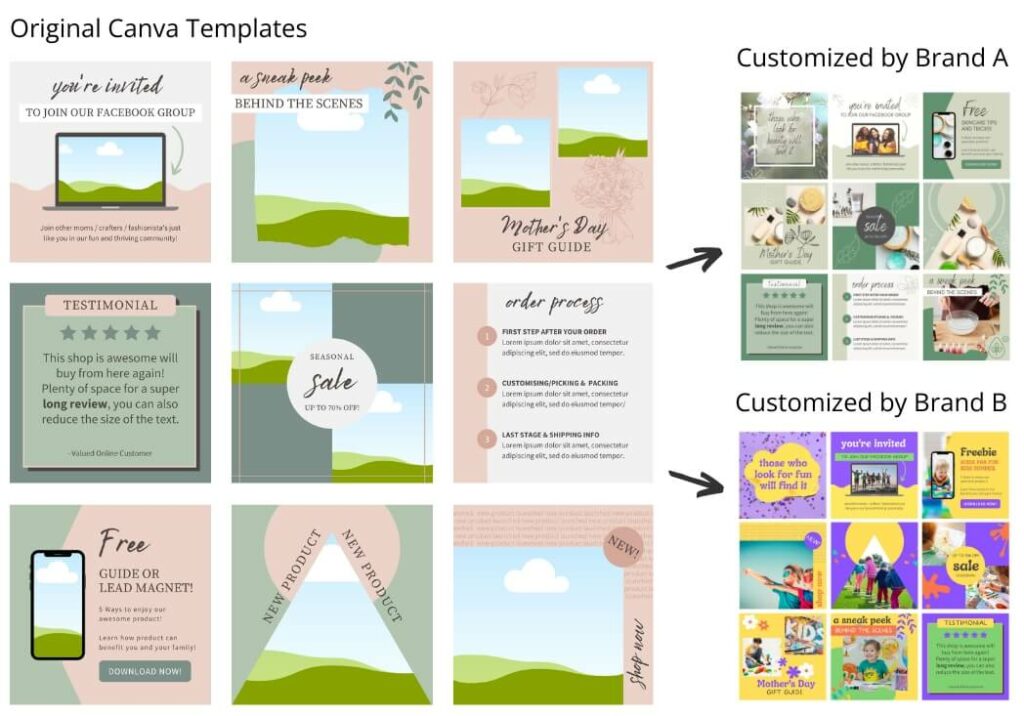
One of the most common mistakes I see people make is not really customising or editing the template much, if at all. If you want your designs to catch people’s attention, you’ve got to make them your own.
Think of your designs as your brand’s personality. A brand personality is what breathes life into a business’s identity, infusing it with characteristics and values that resonate with its audience.
Even if you’re a small business owner and branded your business yourself – you likely have certain colors, fonts and visual style that you use. Well, those elements need to shine through in your designs. Whether it’s swapping out colors, incorporating your logo, or adjusting fonts to match your brand’s vibe.
Below is an example of how different the free Canva templates I offer can look by changing a few colors and adding in your own photos.
Imagine you’re a coffee shop owner. You wouldn’t want your promotional flyer to look like it belongs to a pet store, would you? Of course not!
That’s why learning how to use Canva for graphic design and tailoring templates to fit your brand is crucial. It ensures that your designs not only look professional but also reflect who you are.
So, next time you’re tempted to use a template straight out of the box, pause for a moment and think:
How can I make this unique and match my business style?
This is one of the reasons why buying Canva templates is a better option than trying to do everything yourself.
2. Overcrowding Designs with Too Many Elements
As a designer I’m a fan of the design principle “less is more.”
It’s one of the core graphic design best practices to follow – I’ve even shared an Instagram post or two about it.
Yet, even for me it’s surprisingly easy to fall into the trap of overcrowding your designs with a mishmash of elements, hoping that by adding to the design will come together. Spoiler alert: it doesn’t.
Imagine you’ve stumbled upon a Canva template that’s bursting at the seams with graphics, colors, text and icons. At first glance, it might seem like the epitome of creativity. But take a step back, and you’ll realize that all that clutter is doing more harm than good.
Overcrowded designs can overwhelm your audience, making it difficult for them to understand the message you’re trying to convey. Instead of drawing attention to what matters most, you’re bombarding them with visual noise – a surefire way to lose their interest.
So, how do you avoid this common design mistake? Start by embracing the power of simplicity.
Start removing the flourishes and the elements making it look crowded and focus on what truly matters. Choose a focal point for your design and let it shine, unencumbered by unnecessary distractions.
Take a cue from minimalist design principles: use white space to your advantage, employ strategic placement of elements, and opt for clean, uncluttered layouts.
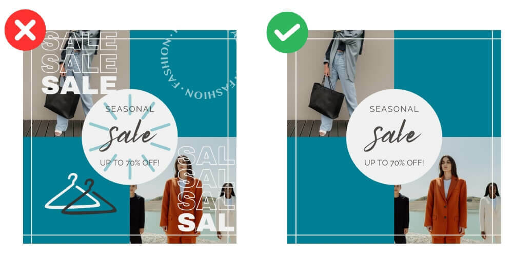
Take the two graphics below as an example, the one on the right is the better design because it conveys all the important information and doesn’t look overcrowded or messy.
Remember, every element in your design should have a purpose. If it doesn’t contribute to the overall message, it’s just taking up valuable real estate.
Next time you’re tempted to throw everything but the kitchen sink into your design, resist the urge. Instead, challenge yourself to convey your message with clarity and elegance and your designs will pack a much more powerful punch.
| Explore this list of the best social media graphic templates
3. Disregarding Typography and Font Choices
Fonts may seem like a small detail in your design, but trust me, they’re anything but insignificant. In fact, typography plays a crucial role in conveying your message and evoking the right emotions from your audience.
The illustration below is the perfect example of this:
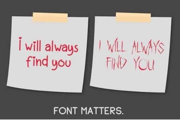
It shows why choosing the right font is important!
So, when it comes to choosing fonts, it’s essential not to disregard the vibe they give off.
If you’ve spent hours perfecting your design, selecting images and colors, the worst thing you can do is you slap on a generic font without giving it a second thought. Suddenly, your carefully crafted masterpiece loses its impact, all because of a lackluster font choice.
Fonts have personality – they can be bold and commanding, elegant and sophisticated, or playful and whimsical. The key is to select fonts that complement your message and resonate with your audience. Think about the mood you want to convey and choose fonts that align with that vibe.
Another common mistake I see is using too many fonts in a single design. Just like overcrowding with elements, mixing too many fonts can create visual chaos. Instead, aim for a combination of two or three fonts – one for headlines, another for body text, and perhaps a third for emphasis.
The next thing you need to do is ensure your font is readable as well. Fancy script fonts might look pretty, but if they’re difficult to read, they’re not doing your message any favors. When in doubt, opt for clean, legible fonts that ensure your message comes across loud and clear.
If you need some font inspiration I’ve listed a variety of free minimalist fonts suitable for a whole host of Canva design projects. There’s also several gorgeous script or handwritten fonts and a handpicked collection of luxurious font styles.
Finally, consider the context in which your design will be viewed. A font that looks great on a computer screen might not translate well to print or mobile devices. Test your font choices across different mediums to ensure they maintain their impact.
So, the next time you’re tempted to overlook your choice of font, think again. They may be small details, but they can make a world of difference in the effectiveness of your designs. Choose wisely, and watch your visuals come to life!
Find the perfect font for your design 👇
4. Skipping Quality Control Checks
Before you hit that ‘publish’ button, there’s one crucial step you don’t want to skip: quality control checks. Trust me, a little extra attention to detail now can save you from a headache (or embarrassment) later on.
The most common of course are those easily missed typos. We’ve all done it – and seen them out in the wild.
Even one seemingly small error can have a big impact on how your business is perceived.
That’s why quality control checks are your best defense against these types of mishaps.
Take the time to review your design with a critical eye, checking for spelling and grammar errors, ensuring proper alignment and spacing, and confirming that all elements are where they should be.
I swear by tools like Grammarly’s free browser add-on in order to catch most of my typos. And I’m not the best at spelling!
It’s also a good idea to test your design across different devices and screen sizes. What looks great on your computer screen might not translate well to a mobile device or printed material. If you conduct thorough quality control checks, you can ensure that your design looks its best, no matter how it’s viewed.
Don’t rush through this step – quality control is not a box to be checked off hastily. Take the time to review your design multiple times, preferably with fresh eyes, or even better, have someone else take a look. A fresh perspective can often catch mistakes that you might have overlooked.
Remember, your design is a reflection of you and your brand. Skipping quality control checks is like sending a half-baked product out into the world. For further help, this Canva resource has design tips for non-designers.
So, before you call it a day, take a moment to give your design the once-over it deserves.
5. Neglecting to Organize Your Canva Files
Even if you don’t create many designs in Canva, you’ll soon start to lose the whereabouts of certain designs, and realize your Canva dashboard is starting to look a little messy!
Trying to find a specific template in a cluttered mass of files is enough to make even the most carefree designer break into a cold sweat.
It’s worth taking the time to create a logical folder structure and categorize your templates accordingly. Whether it’s by project type, client name, or design style, find a system that works for you and stick to it. Trust me, future-you will be grateful!
And don’t forget to periodically revisit and update your template library. As your design skills evolve and your brand identity evolves, so too should your templates. By keeping your library fresh and organized, you’ll always have the tools you need to create stunning designs with ease.
So, the next time you’ve finished creating a design in Canva, don’t just close the tab and forget about it. Take a moment to name it with keywords you might use to search for it in the future and save it into a suitable folder.
Need Professional Grade Canva Templates?
If you’re looking for top-quality Canva templates for your business, check out my Canva templates store, perfect for entrepreneurs, coaches, and small brands.
You’ll find a diverse collection of social media post templates and a variety of versatile Pinterest pin templates designed to elevate your brand.
Take a look around now and find the perfect templates to enhance your marketing efforts and captivate your audience.